Components
Spinner

A spinner, useful for indicating that some kind of operation is happening. There are a couple default ones, but you can also pass your own "frames."
import "github.com/charmbracelet/bubbles/v2/spinner"

s := spinner.New()
s.Spinner = spinner.Dot // or spinner.Line, spinner.MiniDot, etc.
s.Style = lipgloss.NewStyle().Foreground(lipgloss.Color("205"))
Built-in Spinners
spinner.Linespinner.Dotspinner.MiniDotspinner.Jumpspinner.Pulsespinner.Pointsspinner.Globespinner.Moonspinner.Monkey
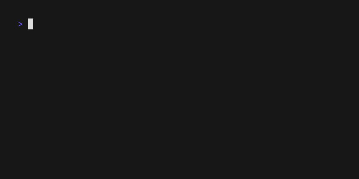
Text Input
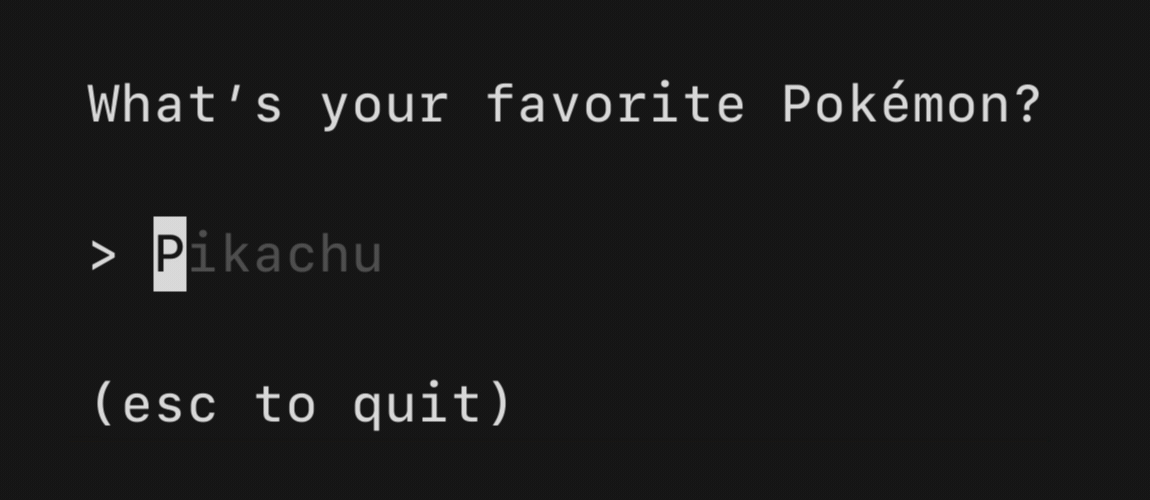
A text input field, akin to an <input type="text"> in HTML. Supports unicode, pasting, in-place scrolling when the value exceeds the width of the element.
import "github.com/charmbracelet/bubbles/v2/textinput"

ti := textinput.New()
ti.Placeholder = "Enter your name"
ti.Focus()
ti.CharLimit = 156
ti.Width = 20
Text Area
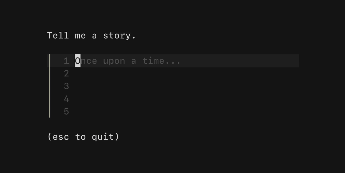
A text area field, akin to a <textarea /> in HTML. Allows for input that spans multiple lines.
import "github.com/charmbracelet/bubbles/v2/textarea"

ta := textarea.New()
ta.Placeholder = "Once upon a time..."
ta.Focus()
Table
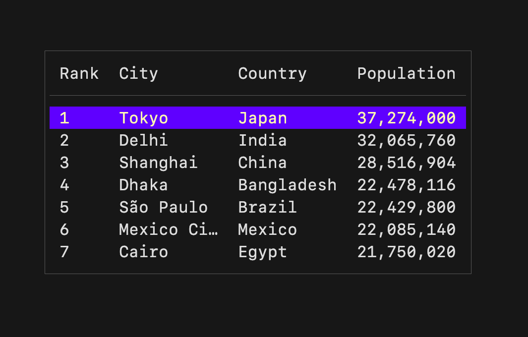
A component for displaying and navigating tabular data (columns and rows). Supports vertical scrolling.
import "github.com/charmbracelet/bubbles/v2/table"

columns := []table.Column{
    {Title: "Rank", Width: 4},
    {Title: "City", Width: 10},
    {Title: "Country", Width: 10},
}

rows := []table.Row{
    {"1", "Tokyo", "Japan"},
    {"2", "Delhi", "India"},
    {"3", "Shanghai", "China"},
}

t := table.New(
    table.WithColumns(columns),
    table.WithRows(rows),
    table.WithFocused(true),
    table.WithHeight(7),
)
Progress

A simple, customizable progress meter with optional animation via Harmonica.
import "github.com/charmbracelet/bubbles/v2/progress"

p := progress.New(progress.WithDefaultGradient())
// or
p := progress.New(progress.WithScaledGradient("#FF7CCB", "#FDFF8C"))
Paginator

A component for handling pagination logic. Supports "dot-style" pagination and numeric page numbering.
import "github.com/charmbracelet/bubbles/v2/paginator"

p := paginator.New()
p.Type = paginator.Dots // or paginator.Arabic
p.PerPage = 10
p.SetTotalPages(len(items))
Viewport
A viewport for vertically scrolling content. Includes standard pager keybindings and mouse wheel support.
import "github.com/charmbracelet/bubbles/v2/viewport"

vp := viewport.New(80, 20)
vp.SetContent(longContent)
List
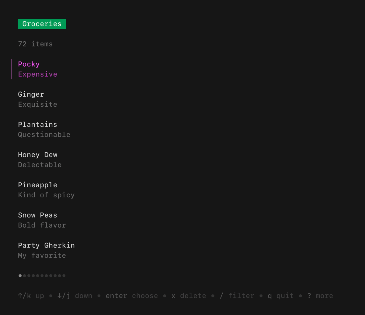
A customizable, batteries-included component for browsing a set of items. Features pagination, fuzzy filtering, auto-generated help, and status messages.
import "github.com/charmbracelet/bubbles/v2/list"

items := []list.Item{
    item{title: "Raspberry Pi", desc: "A tiny computer"},
    item{title: "Arduino", desc: "A microcontroller"},
}

l := list.New(items, list.NewDefaultDelegate(), 0, 0)
l.Title = "My List"
File Picker
A customizable component for picking a file from the file system.
import "github.com/charmbracelet/bubbles/v2/filepicker"

fp := filepicker.New()
fp.CurrentDirectory, _ = os.UserHomeDir()
fp.AllowedTypes = []string{".go", ".mod", ".sum"}
Timer
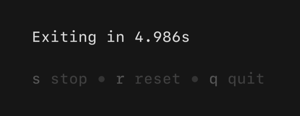
A simple, flexible component for counting down.
import "github.com/charmbracelet/bubbles/v2/timer"

t := timer.NewWithInterval(5*time.Minute, time.Second)
Stopwatch
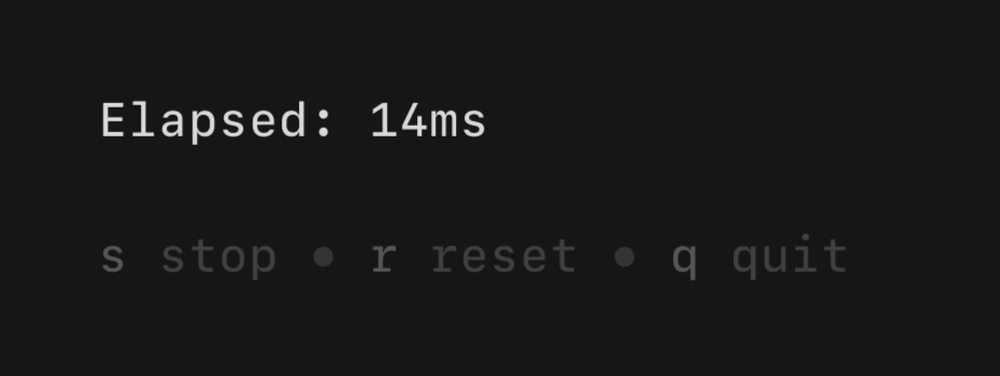
A simple, flexible component for counting up.
import "github.com/charmbracelet/bubbles/v2/stopwatch"

s := stopwatch.NewWithInterval(time.Millisecond * 100)
Help

A customizable horizontal mini help view that automatically generates itself from your keybindings.
import "github.com/charmbracelet/bubbles/v2/help"

h := help.New()
h.ShowAll = true
Key
A non-visual component for managing keybindings and generating help views.
import "github.com/charmbracelet/bubbles/v2/key"

type KeyMap struct {
    Up   key.Binding
    Down key.Binding
}

var DefaultKeyMap = KeyMap{
    Up: key.NewBinding(
        key.WithKeys("k", "up"),
        key.WithHelp("↑/k", "move up"),
    ),
    Down: key.NewBinding(
        key.WithKeys("j", "down"),
        key.WithHelp("↓/j", "move down"),
    ),
}